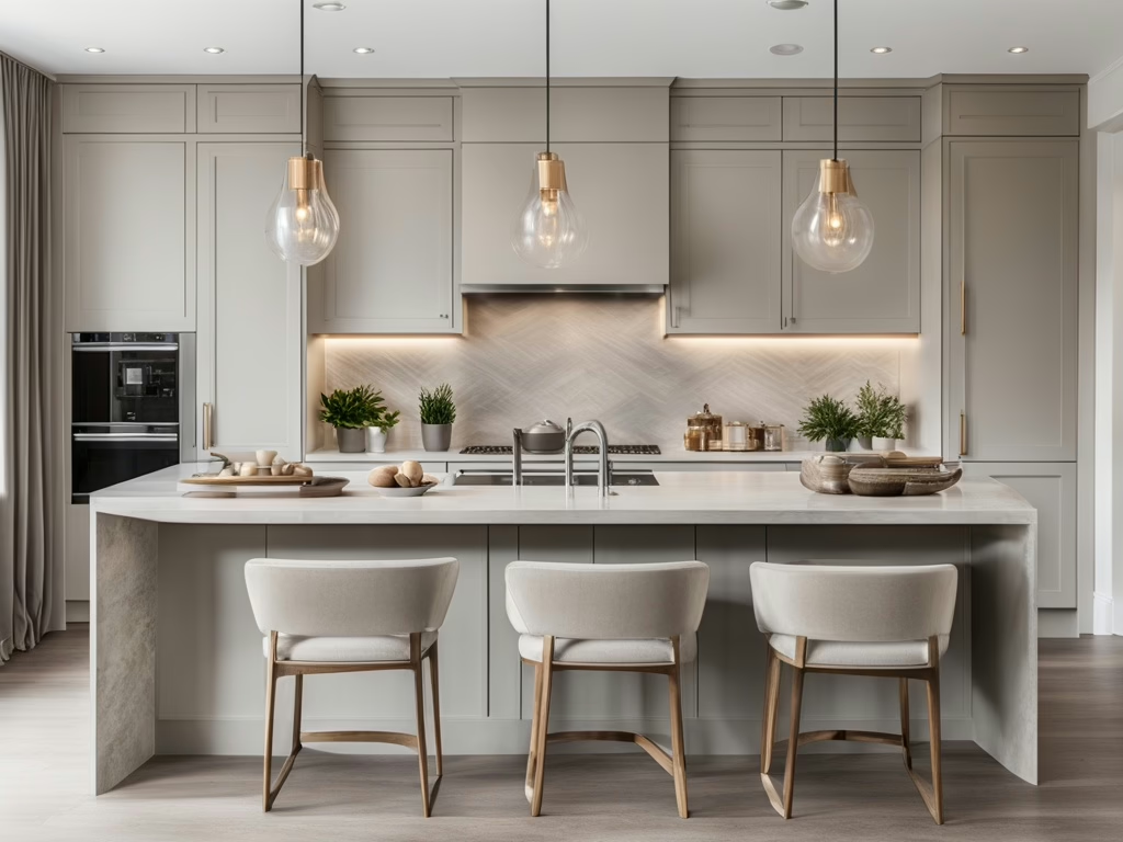
Why Staging a Rental Property for Photos is Essential
When prospective tenants search for rentals online, first impressions are everything. Listing photos can make or break a tenant’s decision to schedule a viewing. Staging a rental property effectively for photos can increase interest, reduce vacancy time, and attract quality tenants who see the home as well-maintained and desirable.
Unlike home staging for buyers, staging a rental focuses on styling with accessories rather than furniture, ensuring the space looks inviting without adding unnecessary bulk.
1. Use Neutral & Consistent Color Tones
A cohesive color palette makes rental listing photos feel polished and professional. Stick with light, neutral tones that make spaces appear larger and brighter.
How to Use Color When Staging a Rental Property for Photos:
- Opt for warm neutrals like soft whites, beiges, or greige to create a clean, fresh backdrop.
- Use matching accessories—such as pillows, rugs, and artwork—to create a consistent theme throughout the home.
- Avoid overly bold or dark colors, which can make rooms feel smaller or less inviting in photos.
A well-balanced color scheme enhances the perception of space and makes the rental feel more high-end.
2. Style Kitchens & Bathrooms for Maximum Appeal
Kitchens and bathrooms are key selling points in rental properties, so they must look pristine in listing photos. A few simple styling touches can make them look more inviting.
Kitchen Staging Tips for Photos:
- Use a stylish bowl of fresh fruit (lemons, apples, or oranges) on the counter for a pop of color.
- Stage with neutral dishware or a sleek coffee setup to create a homey feel.
- Remove countertop clutter to keep the space looking open and clean.
Bathroom Staging Tips for Photos:
- Stack neatly folded white towels to create a spa-like atmosphere.
- Place a small tray with candles or a plant near the sink.
- Use a fresh shower curtain and matching bath mat for a clean, cohesive look.
Even a budget-friendly rental can feel luxurious with small, thoughtful touches.
3. Enhance Bedrooms with Soft, Layered Textures
When staging a rental property for listing photos, making bedrooms look inviting is crucial. Since potential tenants often judge comfort based on visuals, focus on textures and accessories to create warmth.
How to Stage a Rental Bedroom for Photos:
- Use crisp, neutral bedding with layered pillows for a polished look.
- Drape a soft throw blanket at the foot of the bed for a cozy touch.
- Keep nightstands clutter-free—a stylish lamp and a small decorative object are enough.
Simple, well-placed accessories give the bedroom a hotel-like appeal, making it feel more move-in ready.
4. Use Strategic Lighting for Bright, Welcoming Photos
Lighting plays a huge role in how a rental property looks in listing photos. Dark or uneven lighting can make the space feel uninviting, while bright, balanced lighting enhances the appeal.
Lighting Tips for Staging a Rental Property:
- Open curtains and blinds to let in natural light—soft daylight creates the best ambiance.
- Use warm LED bulbs in lamps and overhead fixtures for a cozy feel.
- Add accent lighting, such as battery-powered candles, to brighten dim corners.
Well-lit spaces photograph better and feel more inviting to prospective tenants.
5. Add Greenery & Decorative Accessories for a Lived-In Look
While staging a rental property doesn’t require large furniture pieces, small decorative elements can make a big impact in listing photos.
Key Accessories for Staging a Rental Property:
- Houseplants or faux greenery add life to photos and make the space feel fresh.
- Stylish vases with fresh flowers create warmth in kitchens and dining areas.
- Minimalist artwork or mirrors enhance walls without overwhelming the space.
These small additions give the rental character while keeping it universally appealing.
6. Stage the Entryway for a Strong First Impression
The entryway sets the tone for the rest of the home, making it one of the most important areas to stage for listing photos.
Entryway Staging Tips for Photos:
- Use a stylish doormat to create a welcoming feel.
- Add a small console table with a decorative bowl for keys or mail.
- Hang a mirror to reflect light and make the space feel bigger.
A well-staged entryway makes prospective tenants feel at home before they even step inside.
7. Showcase Outdoor Spaces & Balconies
If the rental has a patio, balcony, or small backyard, stage it to highlight its usability. Many renters prioritize outdoor spaces, so make sure it’s appealing in listing photos.
Outdoor Staging Tips for Rental Listings:
- Add a small bistro table and chairs to showcase functionality.
- Place potted plants to create a cozy atmosphere.
- Keep the area clean and clutter-free for a fresh, inviting look.
Well-staged outdoor areas make the rental feel more spacious and desirable.
Is Your Home Staging Business Ready to Grow?
If you love transforming spaces and want to take your staging skills to the next level, now is the time to elevate your career!
🔗 Join Our Private Facebook Group: Interior Design & Home Staging Business Incubator for expert insights and exclusive networking opportunities.
🔗 Advance Your Home Staging Career with professional certification and hands-on training from the industry’s top experts.