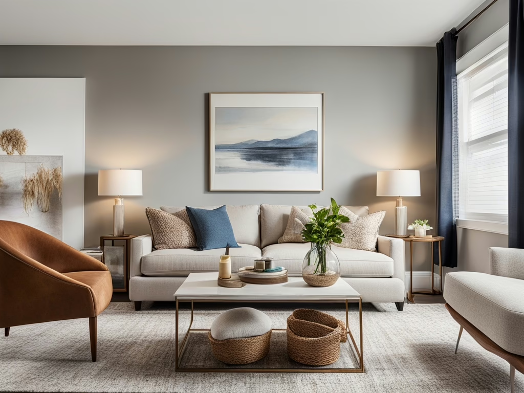
Staging a home on a budget doesn’t mean sacrificing quality or appeal. With strategic planning and a bit of creativity, even budget-conscious designers and stagers can transform spaces into inviting homes that attract buyers quickly. Here are effective tips to master budget-friendly home staging and create an impressive visual impact without overspending.
Why Staging a Home on a Budget Matters
Effective staging is essential in the competitive real estate market. Staging a home on a budget not only maximizes your client’s return on investment but also demonstrates your skill and versatility as a professional designer or stager.
Prioritize Impactful Spaces for Budget-Friendly Staging
When staging on a limited budget, focus your resources on high-impact areas such as:
-
Entryways, which provide the essential first impression.
-
Living rooms, typically the main gathering area.
-
Kitchens and bathrooms, spaces buyers closely scrutinize.
Strategically investing in these areas ensures your budget goes further and makes a strong impression.
Budget-Conscious Paint Updates for Maximum Appeal
A fresh coat of paint is a cost-effective yet powerful way to stage a home on a budget. Opt for neutral colors to appeal to the broadest audience, such as:
-
Whites and creams for openness.
-
Soft grays for sophistication.
-
Warm taupes to create comfort.
Creative Accessories Enhance Staging on a Budget
Accessories are your best friend when staging a home affordably. Thoughtful touches such as:
-
Stylish throw pillows and cushions.
-
Affordable wall art or mirrors to expand visual space.
-
Fresh greenery or flowers for vitality and warmth.
These simple additions significantly enhance the perceived value without high costs.
Lighting: An Affordable Upgrade for Staging Success
Proper lighting dramatically transforms rooms without a significant investment. To make spaces brighter and more welcoming:
-
Replace bulbs with bright, energy-efficient LEDs.
-
Use floor and table lamps strategically.
-
Maximize natural light by using sheer curtains.
Smart Furniture Choices for Budget Home Staging
If furniture is required, choose cost-effective options that look upscale and stylish:
-
Use rental furniture or borrow pieces if possible.
-
Opt for neutral-colored furnishings to maintain flexibility.
-
Repurpose existing items with fresh paint or slipcovers.
Decluttering and Organization Are Free and Effective
One of the most budget-friendly strategies is simply decluttering:
-
Remove unnecessary personal items and bulky furniture.
-
Organize spaces thoroughly to highlight room potential.
-
Utilize storage boxes and bins for hidden organization.
Leverage Professional Connections for Cost Savings
Collaborating with local businesses or other professionals can reduce staging costs significantly:
-
Establish relationships with furniture rental companies.
-
Partner with local artists for affordable art pieces.
-
Develop mutually beneficial agreements with home improvement stores for staging items.
Take the Next Step in Your Staging Career
Ready to elevate your staging skills and attract more clients?
🔗 Join our Interior Design/Home Staging Business Incubator Facebook Group for ongoing expert tips and community support.
🔗 Explore our Home Staging Certification Courses and take your staging business to the next level.