How to Refresh Your Home Without a Full Renovation
Introduction
If your home feels outdated, but a full renovation isn’t in the budget, there are plenty of creative ways to refresh your home without a full renovation. By making strategic updates, you can transform your space while saving time and money.
1. Update Your Walls with Paint or Wallpaper
- A fresh coat of paint in a modern shade can instantly change the atmosphere of any room.
- Peel-and-stick wallpaper offers a temporary and affordable way to add personality.
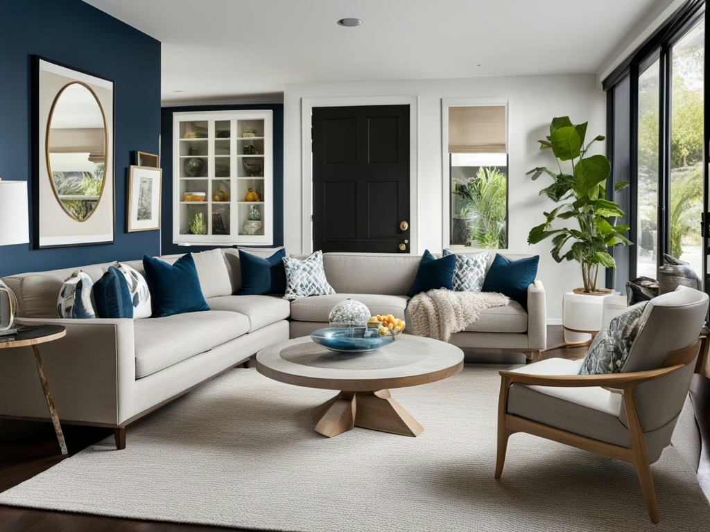
- Accent walls create depth and focal points without requiring major changes.
2. Swap Out Hardware and Fixtures
- Replacing cabinet handles, doorknobs, and light fixtures can modernize your home.
- Swapping outdated faucets and showerheads creates a high-end feel.
- Statement lighting can dramatically enhance a space with minimal effort.
3. Refresh Your Home with Textiles
- New throw pillows, rugs, and curtains can revamp any space.
- Layering textures (velvet, linen, and wool) creates a cozy and luxurious vibe.
- Swapping bedding and towels for fresh, high-quality fabrics elevates everyday comfort.
4. Upgrade Your Flooring Without Replacing It
- Area rugs can cover worn flooring while adding warmth and style.
- Peel-and-stick floor tiles provide an affordable way to update kitchens and bathrooms.
- Refinishing or staining hardwood floors can breathe new life into them.
5. Add Greenery for Instant Freshness
- Houseplants purify the air and add vibrancy to any room.
- Hanging planters and vertical gardens save space while enhancing aesthetics.
- Faux plants provide a low-maintenance alternative with the same visual impact.
Call to Action
Ready to transform your home without a full renovation? Start small with these updates and see how they refresh your space!
🔗 Join Our Interior Design & Home Staging Business Incubator
🔗 Explore Our Design & Staging Courses